Hello!
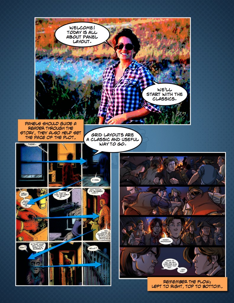
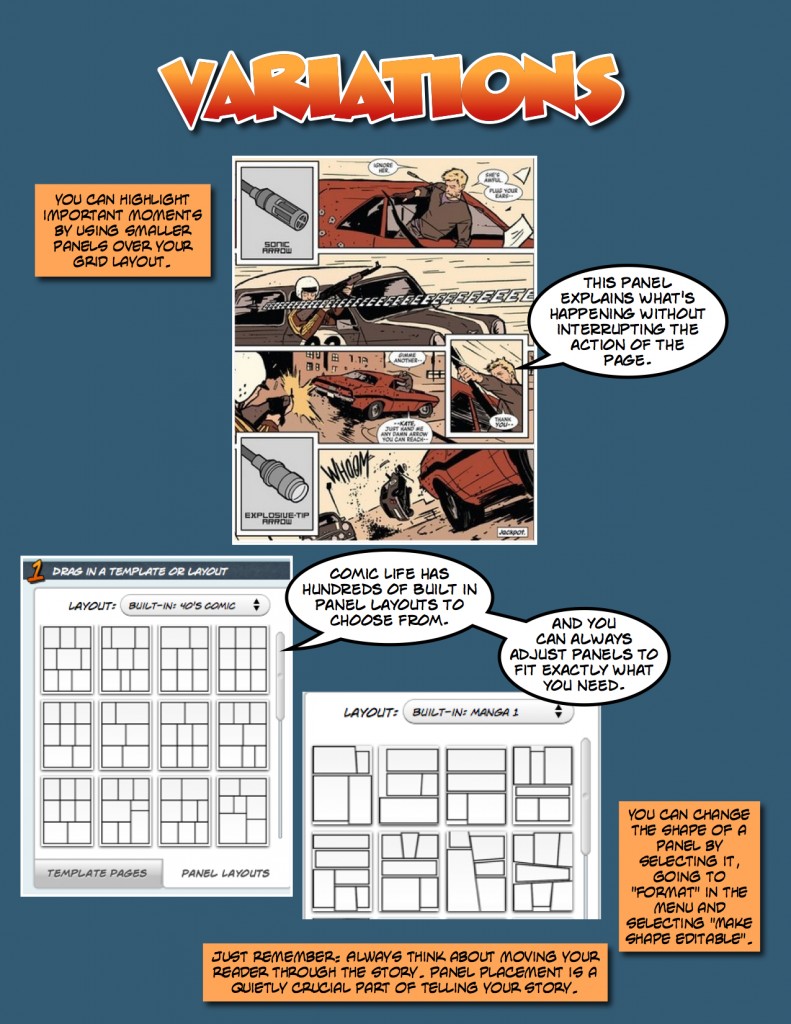
This week we’re talking about using panels in comics. Image panels can be extremely helpful in setting the pace of your comic and guiding a reader through the plot. If a story has a steady progression the panels can enhance that by being evenly spaced, identical in size and unobtrusive. Sometimes you will want to highlight things in your comic (panorama shots, action sequences…), for this you can create larger panels or overlap panels to change the pace on the page.
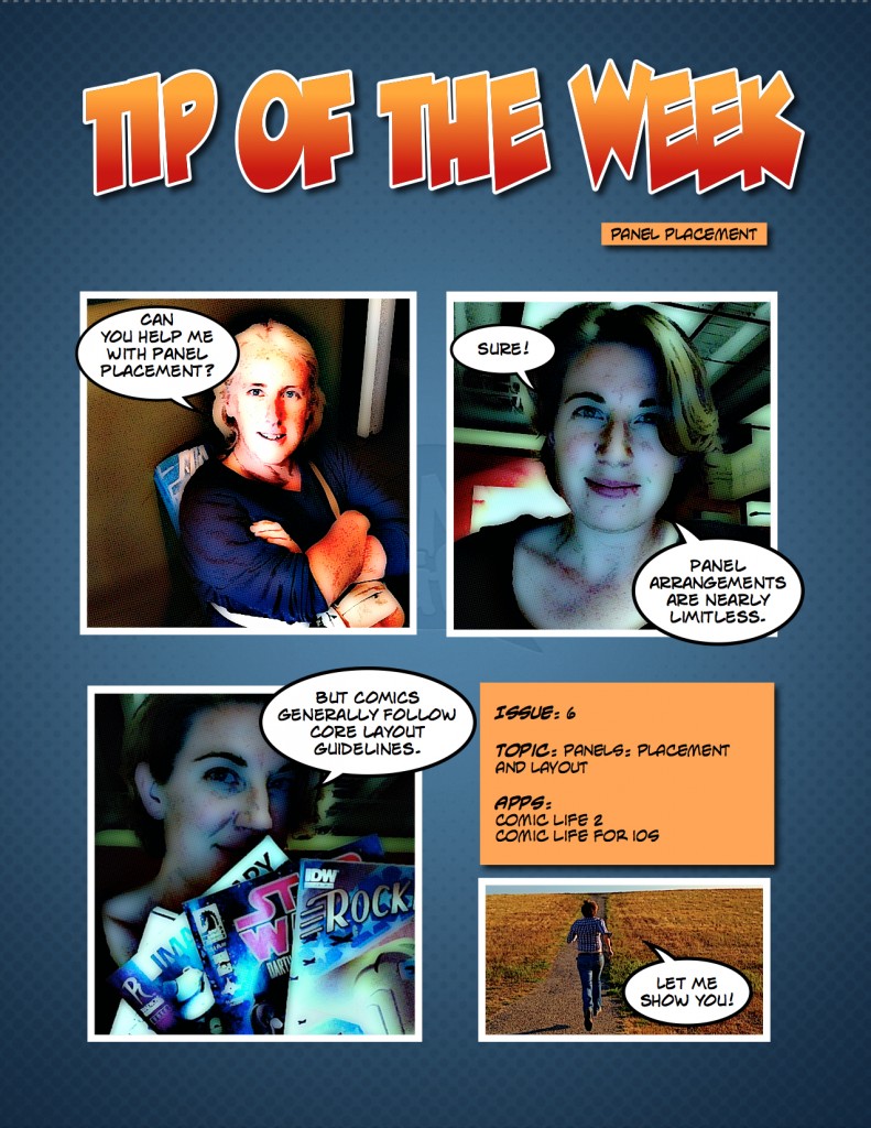
This comic discuses overall basics of using panels in comics, mainly the variation on the 9-panel grid layout. Of course there is a lot more to know about panels, so check back in for another Tip Of The Week!


