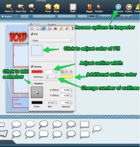
We’ve realized that the change from Comic Life 1 to Comic Life 2 is a big one as far as the User Interface – hopefully for the better! But to make the transition as smooth as possible I’m going to highlight how to do a few things in Comic Life 2.
The User Interface
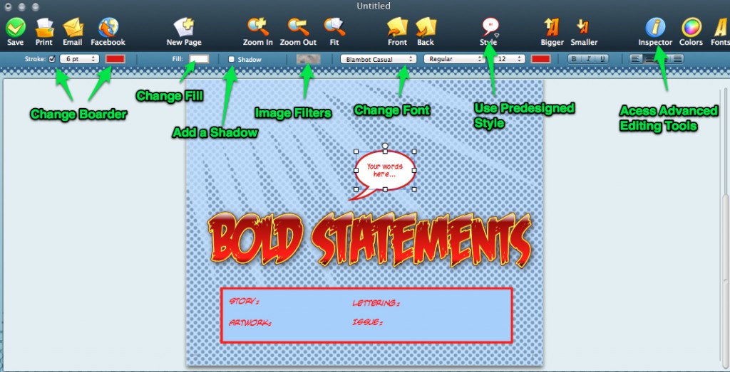
Here is a screenshot of the Comic Life 2 User Interface with a few of the features explained.
To learn more about the editing options in Comic Life 2 continue reading…
Image Filters
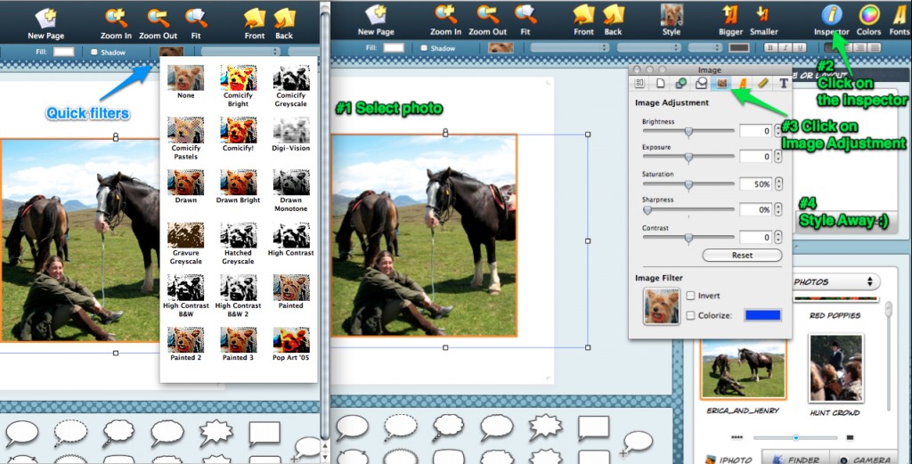
Images can be filtered to look more like comic book drawings or they can be left in their natural state of wonderfulness. Some of the templates that we have in Comic Life 2 come with predesigned filters, but not to worry – you can change it to anything you’d like. To access the quick filters select the image and then go to the icon above the page that has the little dog picture. Or you can access the advanced levels in the Inspector.
Element Fill
When we say “elements” we mean: lettering, photo panels, balloons, captions boxes, and shapes. You can change all of the element colors in Comic Life 2 using the “Fill” button. We have a palet of solid colors as well as a selection of gradients to pick from, and you can always use our color wheel to create your own.
Panel Options
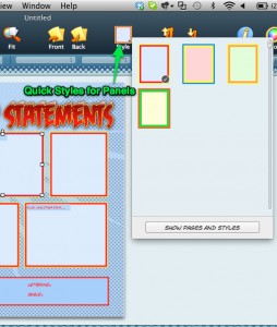
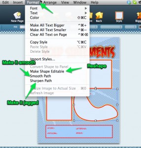
The panels are the boxes that hold pictures. You can do so much with panels – adjust color, add boarders, add shadows, resize and reshape. Here are some screenshots of where you can find these editing options.

