Everyone, please let me introduce you to our friend, Steve Bee.
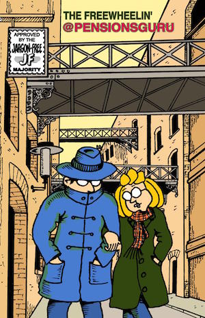 Most people wouldn’t put the economics of pension planning and comics in the same conversation, but that is exactly what Steve Bee does. Steve is one of the leading experts on pensions in the UK and has worked to educate people on making smart long term financial decisions. In order to make the economics of retirement more approachable Steve created his comic-alter-ego in PensionsGuru, a comic series that intertwines financial education with humor and relatable characters. But this isn’t where Steve started with comics. He started his first long running strip, Buffalo Bill Amos, when he was still in school.
“I used to draw at school to keep my friends amused. The characters were based on my friends. They’re still amused by it, so I still draw it. The strange thing is the strip now has a much wider circle of readers than just the people I used to go to school with.”
For Steve, there is something unique to the comic format that is integral to his story telling. “All of my stories are told in comic-book form… One day I’m sure people will look back and generally recognise comics as a separate and unique art form. There are things comics can do that cannot be replicated in film or written books; and the grammar of comics and the fact we all intuitively understand its rules interests me enormously.”
 Steve’s process for creating his comics has evolved since first sketching out his Buffalo Bill Amos comics during class. He first started using Comic Life as a tool to layout his panels and balloons, printing out the already lettered pages and then filling in the panels. Then he would scan it all at once and send it in to the publishers.
“Over time I experimented more with Comic Life and now use it to construct all of the artwork from scanned character and background drawings. It is a very intuitive program to use and doesn’t get in the way of or slow down the creative process. I find it amazingly useful for constructing complex scenes from separately scanned elements, each of which can be cut out (with the instant-alpha tool) re-sized and repositioned in multiple layers. I have tried many other (mostly more expensive) programs, but none offer the intuitive feel and time-saving simplicity provided by Comic Life. I also like the sounds Comic Life makes too – they add to the intuitive feel and the fun of creating comics.”
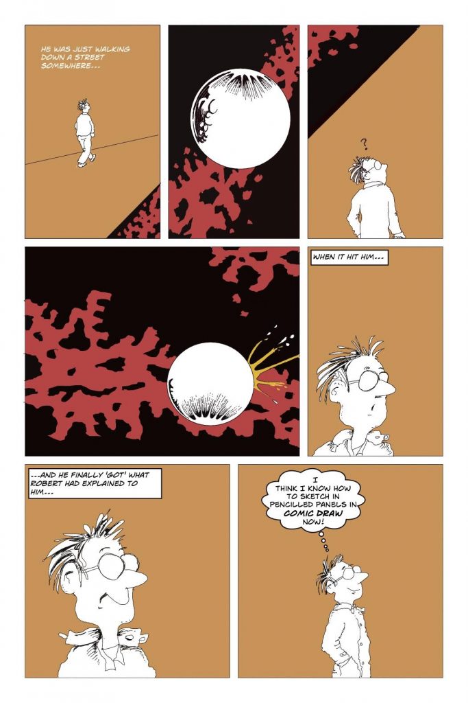 Steve has also been helping us beta test our new app for up and coming comic artists, Comic Draw. With all of his comic talents we thought he could give us some insight into how to make the best comic creation app ever. Fortunately for us he liked
where we were heading with it – “Like Comic Life, I find Comic Draw is really intuitive to use and had no trouble at all getting straight down to drawing with it… I really did just pick up the stylus and start drawing to see what the software did. To me that seems significant; there is clearly no need for anyone to be an expert in using other digital-drawing software to be able to use Comic Draw – you just open the app and off you go.”
We asked Steve if he had any advice for young artists out there:
“Practising your drawing skills every day is important. Draw your friends, your relatives, your neighbours, your teachers (but don’t let your teachers see the drawings – that was a big mistake I made) and anybody and everybody. Learn to draw objects and scenes too and then start combining them together to make stories. The last bit, making drawings into comic-book stories, used to be hard to do, but today using the Comic Life program it’s not a big deal any more. Look too at as many of today’s comics and webcomics you can find – really look at them – and work out how the writers and artists do what they do and then see how you can use their techniques in your own way. If you do that for long enough people will soon think of you as a comic-book artist and writer; eventually you may even come to regard yourself as a comic-book writer and artist too.”
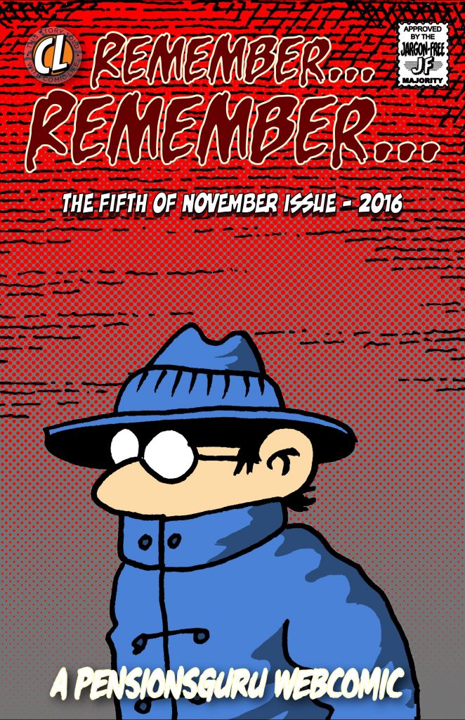
“This comic cover uses the new zip-tone (halftone) type dots that I think really have enhanced the Comic Life product this year. Really an excellent feature. What I’ve also done with this cover though is to have drawn a series of hatching lines that I then scanned and dropped into the Comic Life software and then cut out all of the non-black areas using the instant-alpha tool. That was really fiddly and took a lot of time, but I’ve saved that work as a separate cut-out file so I can use it over and over (at various sizes) in future comic work, so it’s not work that was wasted.
I then dropped the cut-out hatching on to a layer above the dots and below the character, lettering and logos. A five-minute job, but a really pleasing effect I think.
You can use the same technique to cut out rain effects too.” – Steve Bee
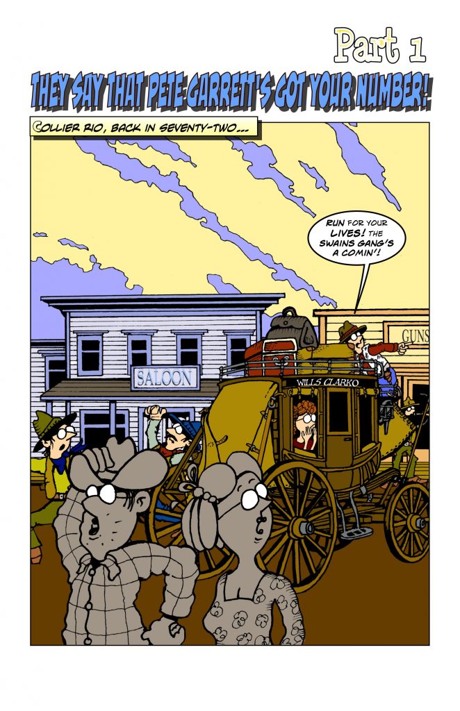
“This is one of my favourite pages from my Buffalo Bill Amos Rides Again webcomic – and one many of my Twitter followers really liked.
The picture itself is constructed of nineteen layers, with every element in it on a separate layer. I have no idea how many layers Comic Life can support, but I suppose I’ll eventually find out when I come to do some of the crowd scenes I’ve got in mind for later chapters in this comic.
Each of the characters, the buildings, the pieces of luggage, the stagecoach and the sky were drawn as individual drawings in pen on paper, then coloured digitally and cut out in Comic Life using the instant- alpha tool. Re-sizing them and positioning them to compose the final scene was great fun and took me a whole Bob Dylan album’s worth of time to complete.
Interestingly, the Wills Clarko sign on the stagecoach (I have a friend called Bill Clarke) was bent to the shape of the artwork using another great feature of Comic Life that lets you completely transform the shape of lettered headers.” – Steve Bee
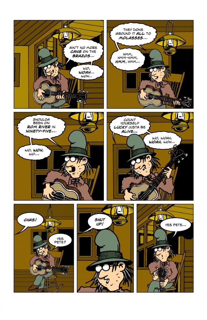
“This page is from my Buffalo Bill Amos Rides Again webcomic. The backgrounds were drawn in ink on paper and coloured digitally and then cut out using the instant-alpha tool in comic life. The windows and doors were cut out too so they’d show things outside. For this scene though I simply set the background fill colour in Comic Life to black to get the nighttime effect, which allowed for some nice lighting differences I could pull along some of the surfaces, particularly on the outside porch. The good thing is I’ll be able to use the backgrounds again, perhaps with whole scenes in a farther background layer showing an outside street-scene perhaps during a future daytime sequence.
The oil lamp in each of the panels is exactly the same cut-out drawing every time; I just re-sized and repositioned it with Comic Life as I composed each scene. That’s a really good and intuitive feature of the software and it enables you to compose within the page itself and get things in balance with the word balloons and characters. Very helpful (and endlessly variable…)
Similarly the rocking chair is the same cut-out picture in each panel – I just re-sized it and moved it on the layer behind my cartoon character (my friend Chas) to make it look as if he was sitting on it. Each picture is thus constructed of six or seven layers.” – Steve Bee
You can stay up to date with all of Steve’s comics at stevebee.com
